My Fish are Man-Eating >:D

Wednesday, March 30, 2011

My sketch-up practice


I had like 10 minutes with Google Sketch-up. It basically served as an experiment to see what we could do during lunch. I think I have work to do. I tried to make a chair....didn't quite work.

Saturday, March 26, 2011

If only :/

This is just a short little blog post for tech. Something that I sort of heard through the grape vine is because Square Enix will not be getting around to a Final Fantasy VII remake anytime soon both pre-earthquake and post-earthquake, I heard that fans of the game are in the process of re-making it themselves. I saw footage of it a year ago so I can't find it this second, but who wouldn't get annoyed after seeing this? If you have played Crisis Core, the graphics are similar to this. Anyway if and when I find it I will update this post, but for now enjoy tease as you see what could've been.

Romanticism Dry-Point Print.

I'm back!!! Right off the bat this has been a very busy week. For one, there is lots of Yearbook stuff to do, I had a presentation about furniture designers this week, I have to make a custom chair out of foam and that's just off the top of my head. There is most likely more to do that I am just not remembering. But anyway, on to the main event. Before the break, my class and I were in the middle of the Romanticism unit. For those who don't know what Romanticism is, it was an art movement that commonly based their themes off of myth, literature, legend etc. It stressed strong emotion, imagination, freedom from classical correctness and rebellion against social conventions. We had a choice of two mediums to do our projects in, Dry Point Print and a Collage. I chose dry point print. Now without any further a due, let us get to my Artist statement.


So this is the very first one I made. I call it Inferno. The concept of this print was based off of the first part of Divine Comedy called Inferno by Dante Alighieri. This print shows main character Dante stuck in the 9th and final layer of hell(which is described as icy instead of fiery) reaching for a door which is supposed to be the exit out of hell into Purgatory. This was the very first one that I created and I think it turned out the best technically. I feel like I used a lot of leading lines to point to the prints intended focal point which was the door. I wanted to emphasise the door as the focal point by making the door the biggest thing in the foreground.
After my first print, I then started to use colour in my prints. The colour helped people tell if it was ice or stalagmites. In this print I more wanted to stick to darker colours because in the print proceeding this one, I used lighter colours that did not show up well on the paper. In this particular print, I tried to make it so the focal point wasn't the entire door but the doorknob. I would say that the colour that stood out the most in this print was the the blue of the ice. It had a very cold, icy look to it.


The intent for my final print was to try some odd colouration for the ice. I layered blue and red on top of each other so they would blend together. Parts of the ice were more red then blue and vise versa. This time, I made the door the focal point by making it the brightest object on the print. To make sure that it show, I mixed a bright yellow together with a dull yellow. It worked really well because the door still looks very bright but it is still visible on the page.

Side note: I know people noticed who that dude is in the background, well that's the devil. There's a whole story for that.

Unfortunately there were mistake in the print that were there when I etched the plate. The lines were uneven, there were smudges on the plate that I couldn't see which printed on to the paper with the image. The ink is also faint on certain parts of the images. That could be because of 2 reasons. 1) The etch lines were too shallow, so they didn't hold the ink properly. OR 2) I wiped too much of the ink out. Anyway, I thought that this was a successful project. I got to work the printer which was cool and I made an cool piece. It wasn't perfect, but it was still pretty awesome. If you're interested in the Divine Comedy story and want the full scoop, check out the link.


Thursday, March 10, 2011

Happy March Break!!!

So it looks like I will not be having a March Break this year. As much as I would like to be playing video games or sleeping in or whatever, I will be tied up with other obligations...or at the very least that's how it looks right now. Anyway, since I will not be blogging at all next week, I just wanted to share a video I saw today as well as wish you all an awesome March Break.

Friday, March 4, 2011

Ones that worked.

Our very first CyberARTS assignment was to make cropping of pastel drawings that we all made that also had somekind of composition. From there we made big Pastel Pieces, Big guestural, abstact painting and then a smaller painting that emphesizes a specific part of the cropping. As seen below are the cropping, pastel and the small painting.
So, below you will find my pastel drawing. That I think turned out the best looking as it had a great use of value and it just visually looked bolder. Personally I think Pastels are messy but I'm proud of how this turned out. The last pastel piece I did didn't go over so well so I'm actually really proud this. One thing with Pastels though is you can't really erase any mistakes that you make. You have to some how make it perposeful.


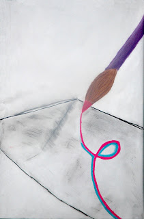
The small painting turned out ok, I don't think it turned out as successful as my pastel. I would've thought that given that the smaller painting was more detailed oriented. To do something kind of interesting I added texture to the paint on the brush and the background.


Thursday, March 3, 2011

CyberARTS Video on Trial: The Good and The Horrible

This is CyberARTS: Video on Trial. Where we dissect "the good" and the "just horrible" of music videos chosen...by me.

Case#1: The first video that I pick to be cut to ribbions was The Best I Ever Had by Drake. Don't get me wrong, I liked the song, but I just don't think at all that the video matched the subject matter. The lyrics show that he's talking about his girlfriend yet somehow that translates to a girls basketball game...ok sure. A follow-up to the first point that I made is the fact that because the video doesn't match the song, there's no cohearent story present in the video, therefore, it felt like visual choices made for the video were not there for artistic vision. I find Best I Ever Had guilty of of having no artistic vision, and making a mis-matched music video which has nothing to do with the song.

Case#2: This would be an example of a good music video...or at the very least good compared to the previous video. Grenade by Bruno Mars was a good video because it followed a cohearent story, the video matched the song's subject matter and lastly, what you're seeing in the video is there to make a point. I find Grenade innocent on the ground of having a proper artistic vision.

That's all for this week see you soon.